
You discover the first images from your shoot and… they’re grey. Dull. As if someone had draped a veil over the screen. Don’t panic: it’s on purpose. And it’s actually a good sign.
Why the image comes out “faded” from the camera
Professional cameras can record in log, a mode that deliberately compresses the contrast to preserve as much detail as possible in both the dark and the very bright areas. The result looks flat and washed out, but it contains far more information than an image that looks “pretty” straight away.
Some cameras go further and record in RAW, that is, the sensor’s raw data, like a digital negative. The RED V-Raptor 8K VV that we use records in REDCODE RAW and the manufacturer claims a dynamic range of more than 17 stops: in plain terms, it sees both the detail of a window in full sun and that of a dark corner of the room.
A log image is a raw ingredient. Nobody judges a dish by its vegetables before cooking.
Correction or grading: two different stages
| Colour correction | Colour grading | |
|---|---|---|
| Goal | Make the image accurate | Make the image expressive |
| What is adjusted | Exposure, white balance, contrast | Mood, palette, the viewer’s gaze |
| Question asked | Is it faithful? | What does it say? |
| Analogy | Tuning the instruments | Playing the music |
Correction sets everything straight: a white must be white, skin must look like skin. Grading then makes artistic choices: warming, cooling, softening, adding contrast, drawing the eye to a face or a product.
The LUT: a starting point, not a magic wand
A LUT (short for Look-Up Table) is a colour conversion table. Two families are often distinguished:
- Technical LUTs, which convert a camera’s log image to a display standard (such as Rec. 709, the one used by most video screens).
- Creative LUTs, which apply a “look”: warmer, more cinematic, more vintage.
Applying a ready-made LUT to all the footage isn’t enough: each shot has its own light, exposure and colours. The colourist adjusts shot by shot so that the whole is consistent.
What colour says
- A warm mood (orange, golden tones) evokes conviviality, craftsmanship, closeness.
- A cool mood (bluish, more neutral) suggests technology, precision, calm.
- Saturated colours give energy; soft colours bring elegance.
The most delicate part remains skin. A successful grade keeps natural complexions, even in a strongly stylised mood. A face that is too orange or too greenish, and all credibility flies out the window.
Brand consistency
Your logo has its exact colours. Your videos should also have a recognisable signature. When we shoot for you several times a year, grading keeps the same visual identity from one film to the next, even if the daylight, the location or the camera change.
Before / after: an example described in words
Tip Before: a craftswoman in her workshop, filmed in log. The image is grey, the window behind her is pale, her hands blend into the workbench, the wood looks dull. After: the contrast is restored, the wood regains a warm brown, the window light keeps its detail, the skin is natural and slightly luminous, a slight darkening of the edges guides the eye to the hands. Same shot, different story.
Our tool: DaVinci Resolve
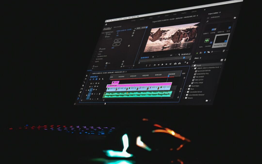
We grade in DaVinci Resolve, Blackmagic Design’s software that brings together editing, grading, effects and sound. Its colour module is a reference: the publisher states that it has been used to grade more high-end films and series than any other system. For you, this means a cinema tool applied to your corporate films.
At that dog, colour isn’t a finish added at the last minute: we think about it from the shoot, filming in log or RAW to keep all the latitude needed. To understand the rest of the chain, our article on picture, sound and light is a good complement to this one.
An image that is true to you
Let’s talk about the mood you want to give your next videos.