
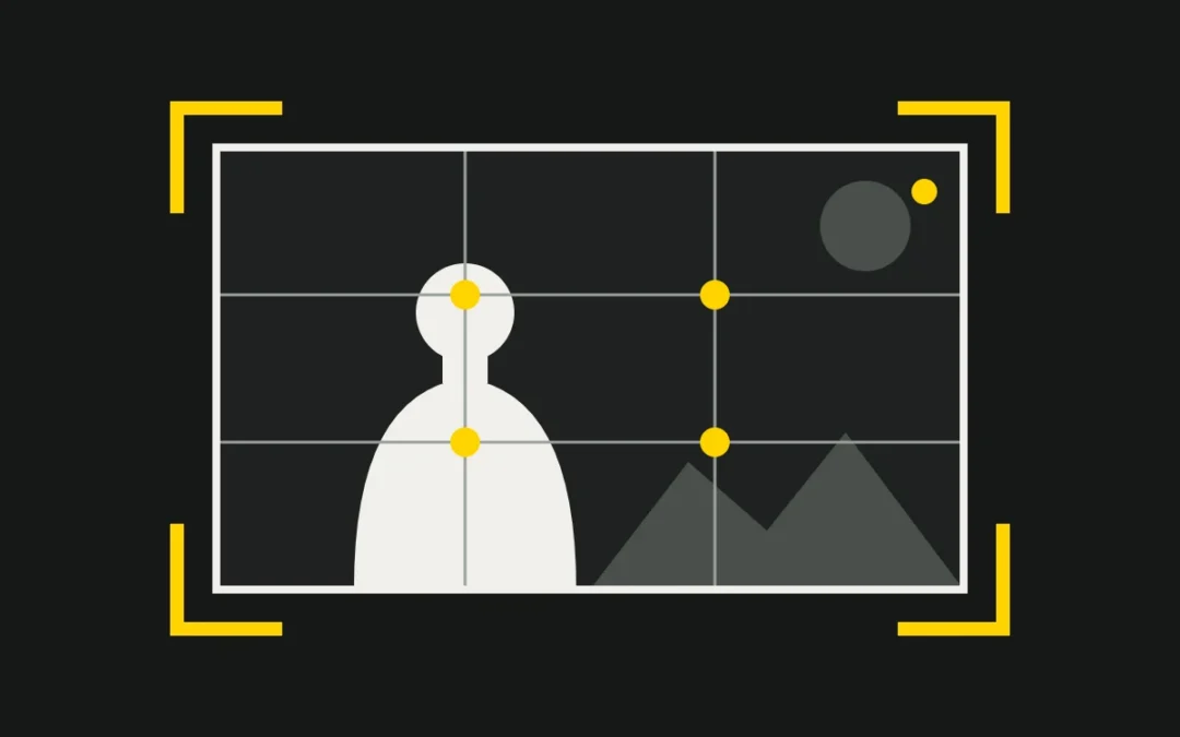
Framing means deciding what the viewer sees, and above all what they do not see. Every shot answers three questions: how far away, from what height, and where the subject sits inside the rectangle of the image. These choices tell the story as much as the script does. Below, we go through shot sizes, camera angles, composition rules (with our own original diagrams), aspect ratio, and then the visual signature of twelve directors. We finish with how we apply all of this to corporate video.
Framing is storytelling
The frame is a window: whatever enters it becomes meaningful, whatever stays off-screen becomes suggestion. A face cut by the edge of the image does not feel like a face surrounded by air. So a framing is never “beautiful” or “ugly” in the abstract: it is right or wrong for the intention. The question to ask before every shot is simple: what should the viewer feel at this exact moment?
The guidelines below are working habits, not laws. Great directors know them well enough to break them at the right moment, and so should anyone who films for a living.
Shot sizes: from vastness to intimacy
Shot size describes how much of the subject is visible in the frame. The closer we get, the more attention goes to emotion and the less to context. Here are the eight sizes we use every day.
| Shot size | What it shows | What we feel |
|---|---|---|
| Extreme wide shot (establishing) | The place, the landscape, a tiny figure. | Where we are, scale, sometimes loneliness. |
| Wide shot | The character within the setting. | Context and relation to space. |
| Full shot | The whole body, head to toe. | Posture, walk, physical presence. |
| Cowboy (American) shot | From the head to mid-thigh, enough to see a holster. | Tension, face-offs, readable action. |
| Medium shot | The character from the waist up. | The ease of a conversation. |
| Medium close-up | Chest and face. | Growing intimacy. |
| Close-up | The face alone. | Emotion, empathy, intensity. |
| Extreme close-up | A detail: the eyes, a hand, an object. | Extreme tension, obsession, the decisive detail. |
A story breathes by alternating these sizes: a wide shot to get oriented, a medium shot to follow the action, a close-up to feel. A film that stays at the same distance becomes tiring; a film that jumps between them for no reason becomes confusing.
Camera angles: power and vulnerability
The height and tilt of the camera give the viewer an almost moral point of view on the character.
- Eye level: neutral and honest; we stand level with the character.
- High angle: the camera looks down. The subject seems smaller, isolated, fragile or trapped.
- Low angle: the camera looks up. The subject grows, asserts itself, dominates or threatens.
- Dutch angle: the horizon is tilted and the world tips over: doubt, intoxication, danger.
These associations are tendencies, not automatic rules. A low angle can also convey a child’s admiration, a high angle a parent’s tenderness. Context and the length of the shot decide: a low angle held for three seconds on a smiling founder says something very different from the same angle on a menacing figure.
Composition rules
Placing the subject
The rule of thirds. Divide the image into three columns and three rows, then place the eyes or the key element on a line, ideally at an intersection. The subject breathes and the image feels livelier than with a dead-centre placement.
Centred, symmetrical framing. A subject in the middle, elements answering each other on both sides: the image becomes frontal, calm, sometimes solemn or ironic. Conversely, an off-centre subject surrounded by negative space (empty area) suggests loneliness or waiting, and leaves room for what is off-screen.
Golden ratio and spiral. This ratio of about 1.618, drawn as a spiral, helps distribute the masses of an image. We treat it as a guideline, close to the rule of thirds, not as a magic formula.
Headroom is the space above the head: too little and the character feels squashed; too much and they float. Lead room (or nose room) is the air left in front of the face or in the direction of movement: without it, the character seems stuck against the edge.
Guiding the eye
Leading lines (roads, corridors, rails, horizons) carry the eye to the subject. When they all converge on a single point, that is one-point perspective: a feeling of rigour, fate or vertigo.
Depth layers. A foreground, a midground and a background give volume to a flat image. An object at the edge of the frame, in front of the subject, also gives the sense of quietly watching the scene.
Frame within a frame. A door, a window, a mirror or an arch frames the subject a second time. It draws attention, but can also confine the character or show them as watched.
Cutting between shots
The 180° rule. Between two characters, draw an imaginary axis and keep every camera on the same side. Cross it and each character swaps sides on screen, so the viewer loses their bearings.
The 30° rule. Between two consecutive shots of the same subject, change the angle by at least 30° (or change the shot size clearly). Otherwise the cut looks like an accidental jump.
Over-the-shoulder shots. The shoulder and back of the head of the character in the foreground anchor the dialogue in space and remind us who is being addressed. It is also a simple use of depth layers.
Aspect ratio: a framing choice
The width-to-height ratio is the first framing, that of the frame itself. 1.33 (4:3) is almost square: it suits faces and verticals. 1.85 is a common, balanced cinema format. 2.39 (“scope”) stretches the image horizontally: landscapes, crowds, loneliness in a vast space. The 9:16 of social media is vertical: it favours one face, a product held in the hand, a person standing, and leaves very little room at the sides.
That is why a shot designed horizontally cannot always be reframed vertically: two people side by side no longer fit, the rule of thirds has to be replayed on a single column, and the bottom of the image must stay clear for app interfaces. So we plan the vertical framing during the shoot instead of hoping to rescue it in the edit.
Directors and their framing signatures
Here are twelve visual signatures, deliberately summarised. We describe them in words, without film stills; we invite you to rewatch these shots.
- Wes Anderson: near-geometric symmetry, frontal “planimetric” shots, the subject at the centre, lateral tracking moves, pastel colour. In The Grand Budapest Hotel, the aspect ratio changes with the era being told.
- Stanley Kubrick: one-point perspective: the corridors of The Shining, those of 2001: A Space Odyssey. A cold rigour that feels almost inevitable.
- Sergio Leone: the alternation of extreme close-ups on eyes and very wide shots of the landscape, notably in Once Upon a Time in the West: the duel is played out in the eyes.
- Akira Kurosawa: long lenses and several cameras filming the same scene, compressed space, groups of characters arranged in clear shapes, weather built into the composition.
- Yasujirō Ozu: a low camera at tatami height, almost always still, and “pillow shots” (landscapes, objects) between scenes. Tokyo Story is the best-known example.
- Steven Spielberg: fluid long takes, a child’s-eye camera height in E.T., and the famous “Spielberg face”: a close-up of an awestruck face looking off-screen.
- Quentin Tarantino: the shot from inside a car trunk (Reservoir Dogs, Pulp Fiction, Jackie Brown), low angles, shots of feet.
- Christopher Nolan: shooting on large-format IMAX 65 mm film (Dunkirk, Oppenheimer), a taller and more immersive image, effects done practically whenever possible.
- Denis Villeneuve: scale: tiny humans facing monumental architecture, in Blade Runner 2049 as in Dune.
- Wong Kar-wai: off-centre, obstructed frames: the character seen through a doorway, a window, a frame edge. In the Mood for Love turns it into a language of restraint.
- Alfred Hitchcock: the character’s point of view (Rear Window), dizzying high angles and the dolly zoom of Vertigo.
- Orson Welles: deep focus with cinematographer Gregg Toland in Citizen Kane, and low angles that reveal ceilings.
Applied to brand films and corporate video
Our job is not to make cinema, but the language is the same. Here is how we adapt it to three common situations in our business videos.
An interview. Medium close-up or medium shot, eyes on the upper third line, a slight three-quarter angle, lead room on the interviewer’s side, measured headroom. A second camera placed at more than 30° lets us cut without a jump. The background stays at a distance and is lit with intent: that is the subject of our article on lighting and chiaroscuro.
A product. Close-ups and extreme close-ups for texture and detail, a slight low angle to give it presence, negative space where the title will go. For a packshot, a centred, symmetrical frame is often the most honest.
A team. A wide shot (sometimes by drone) to place the location, then medium shots and close-ups. We compose in depth layers, arrange people in a triangle rather than a line, use a doorway or a glass wall as a frame, and respect the eyelines.
Vertical. For social media, we centre the subject more, keep margins at the top and bottom for titles and the app interface, and plan the shot for both formats before we roll.
Our habit. Before every shot, we state the intended emotion in one sentence, then choose the size, the angle and the subject’s place. Gear comes afterwards: see our equipment page.
Further reading: Shot (filmmaking); 180-degree rule.
A video project to frame?
Tell us about your brand: we will work out with you the shots that tell its story.